
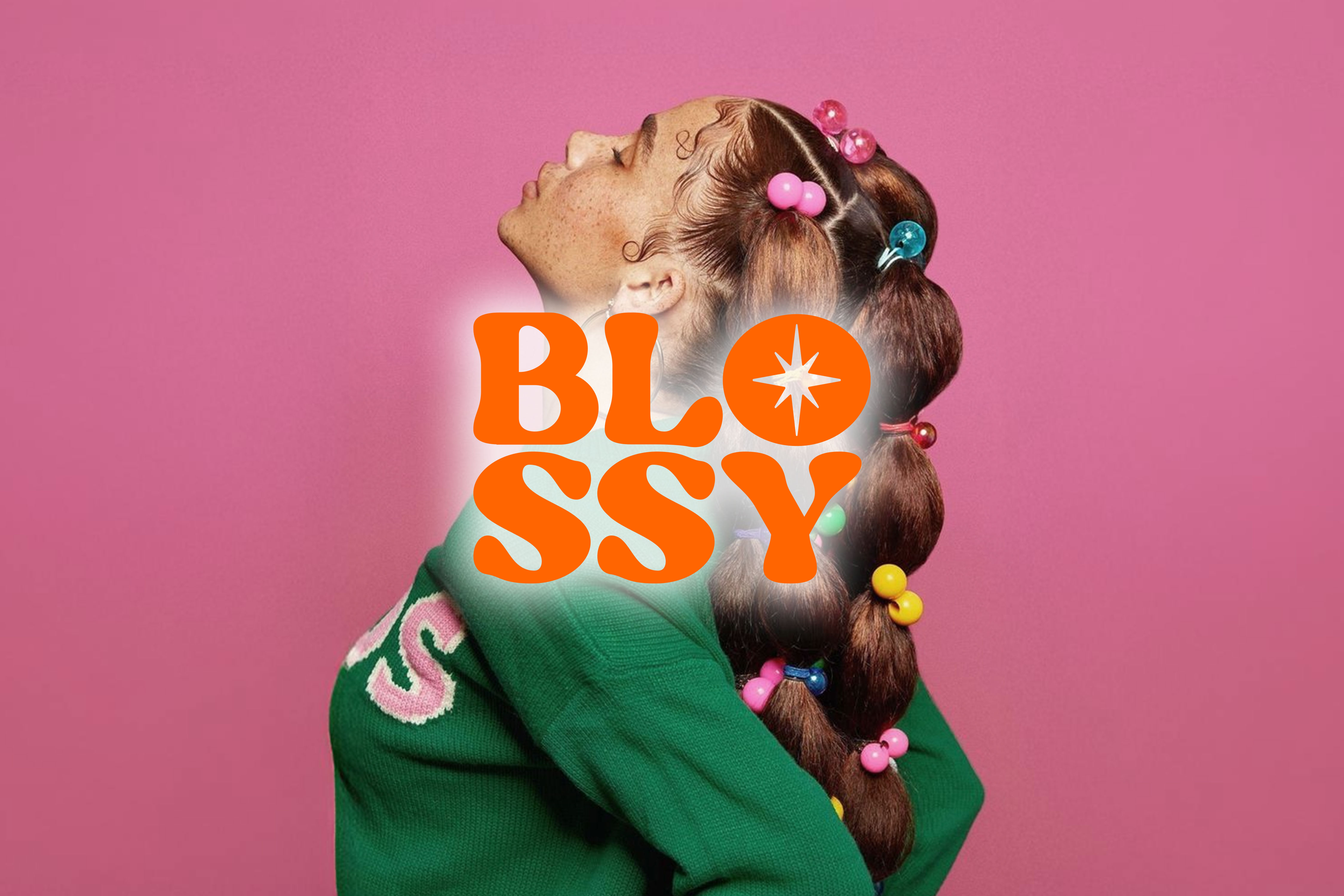
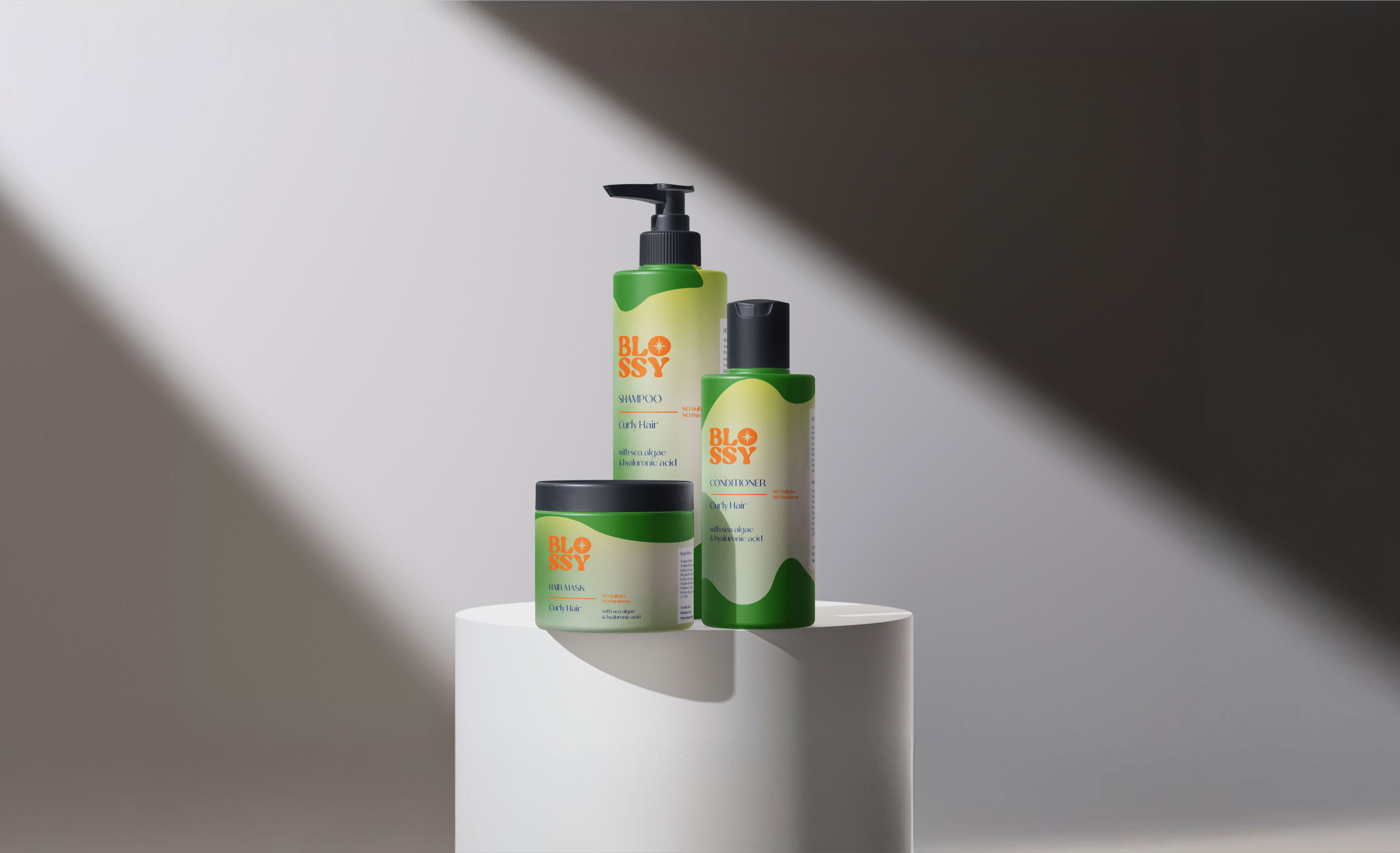
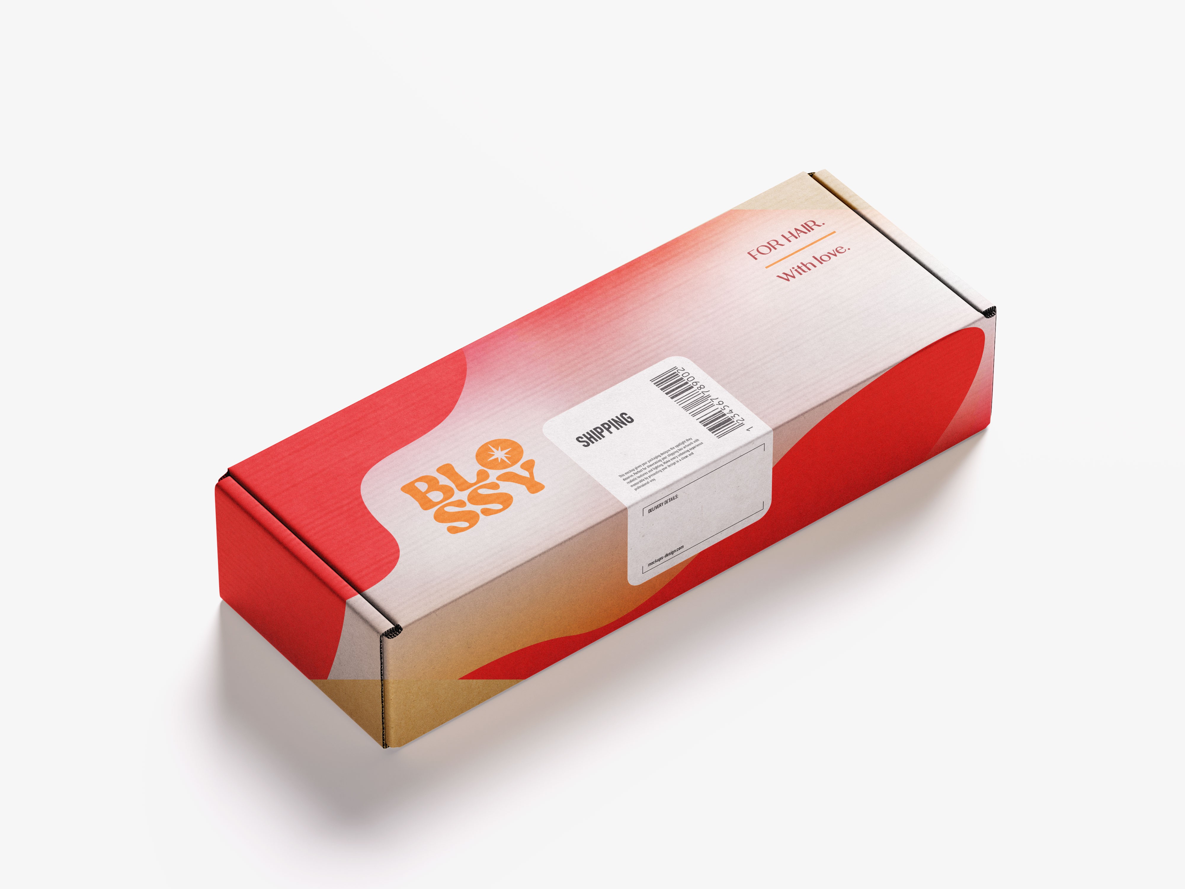
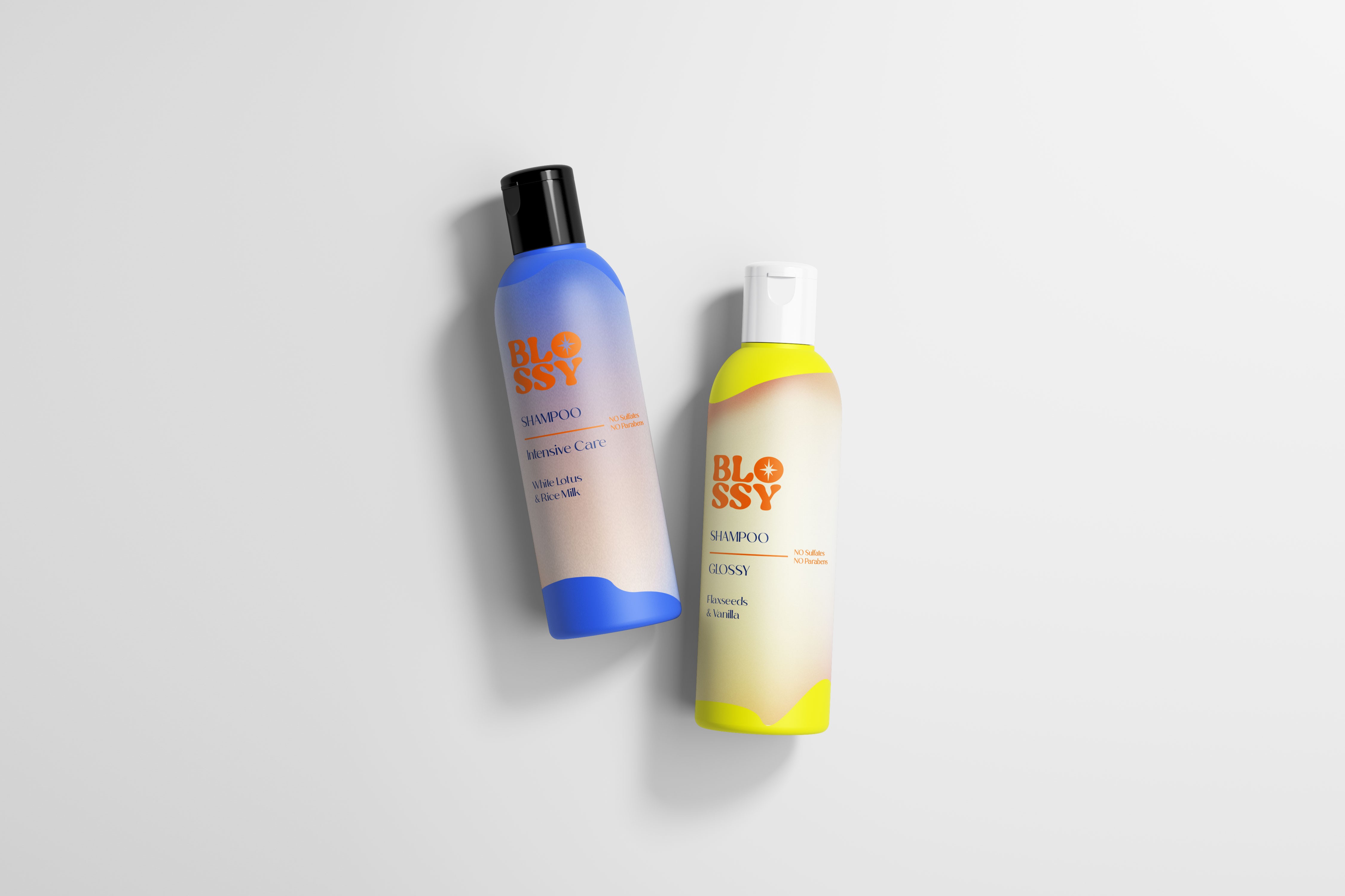
The name “Blossy,” (a clever blend of “boss” and “glossy,”) is all about empowering women who balance strength and self-care. The bold orange logo unapologetically grabs attention, while having nestled in the “O” of Blossy is a shimmering star, a symbol of the glossy, radiant results the products deliver. It’s a subtle yet striking nod to the brand’s promise of shine and brilliance. The design’s use of liquid-inspired elements reflects the effortless, flowy philosophy of the product itself. Just as the liquid formula glides smoothly, the visual identity echoes that sense of ease and grace. From swooping curves to fluid shapes, every detail is designed to evoke motion and simplicity. Each product line within Blossy is distinguished by its own signature color, ensuring easy identification while creating a vibrant, unified aesthetic.
The goal was to craft an identity that speaks to strong, bold women while embracing the fun and effortless nature of the brand. Blossy isn’t just a hair care line—it’s a statement, a philosophy, and a celebration of individuality. Every element of the design was carefully curated to reflect this ethos.
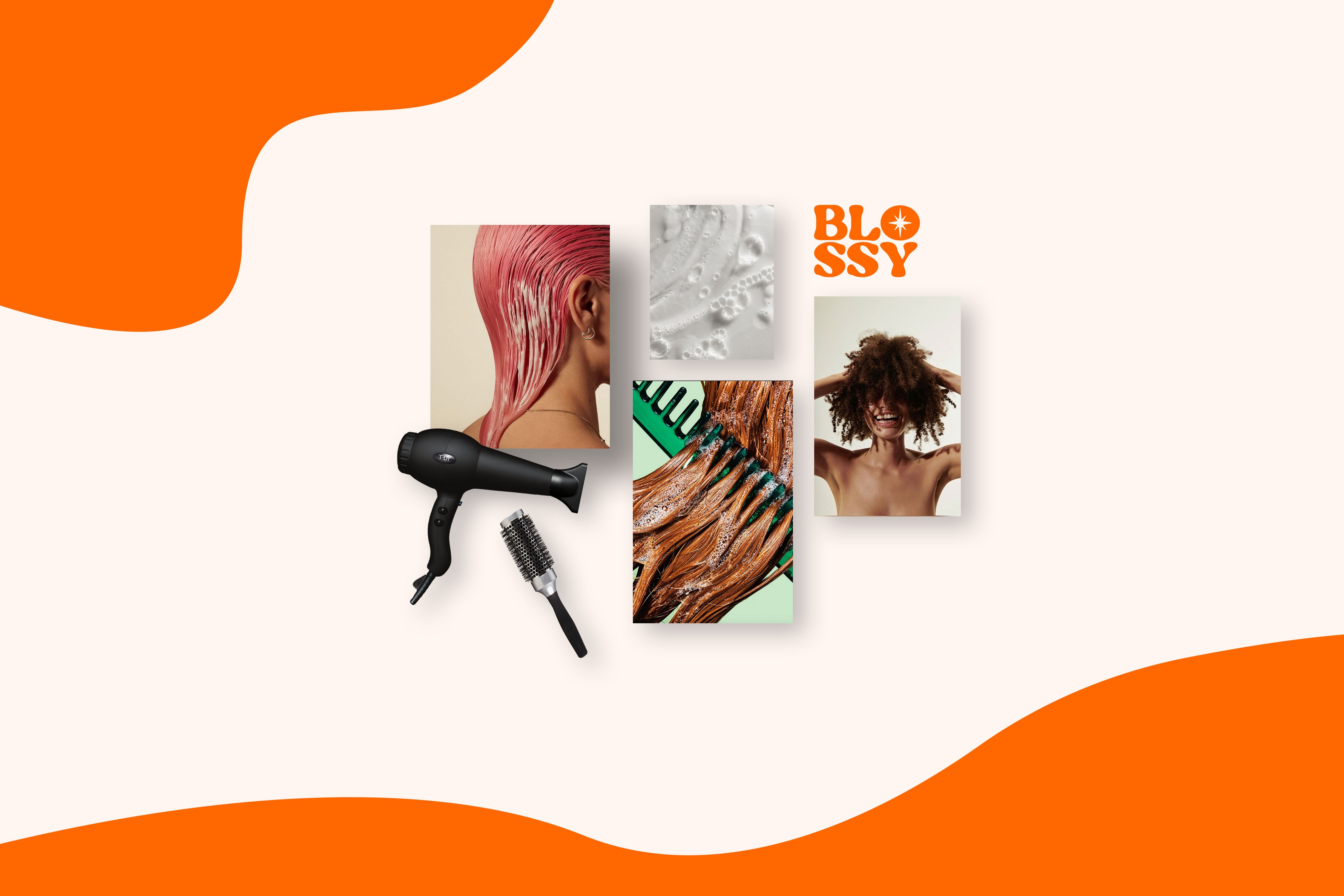
Blossy is more than a hair care line; it’s a celebration of self-expression, confidence, and beauty in all its forms. Designing this branding was about bringing to life a visual identity that empowers, inspires, and resonates with every strong, bold, and glossy woman out there.